Get the latest updates From BL Soni College Bhilwara

How can graphic design be used to create visually appealing event posters?
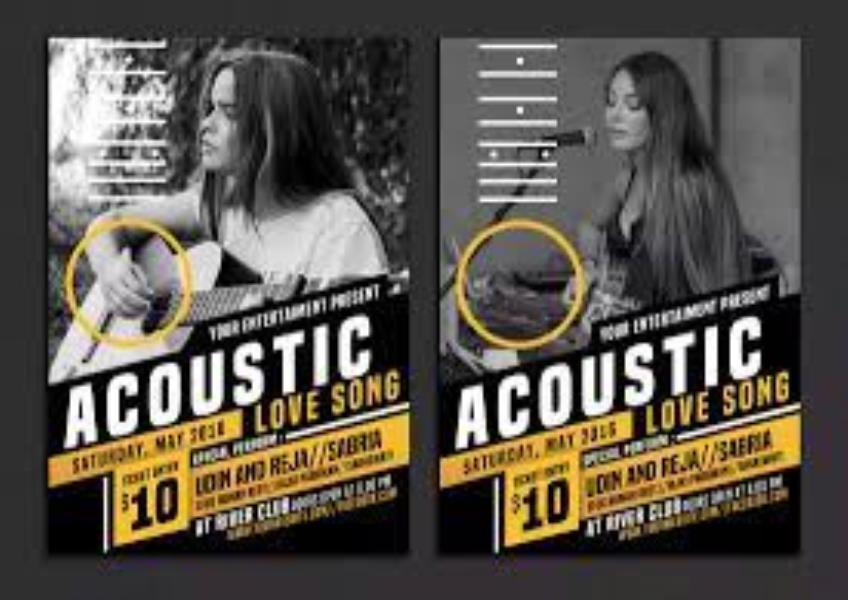
Graphic design is a key element in creating visually appealing event posters that capture the attention of your target audience and convey essential information effectively. Here are some tips on how to use graphic design effectively for event posters: Understand the Event: Start by gaining a deep understanding of the event's purpose, theme, and target audience. This information will guide your design choices. Hierarchy of Information: Organize the poster content with a clear hierarchy. Use larger fonts and bolder styles for important details such as the event name, date, and venue. Less critical information like sponsors or secondary details can use smaller fonts or subdued styles. Typography: Choose fonts that align with the event's theme and are easy to read. Consider using contrasting fonts for the event title, date, and additional information to create visual interest. Color Palette: Select a color scheme that matches the event's theme and evokes the desired emotions. Ensure that the colors used have good contrast for readability. Imagery: Incorporate high-quality and relevant images or graphics that resonate with the event's message. Photos of previous events or images related to the event's theme can be compelling. Layout and Composition: Create a balanced and visually appealing layout. Pay attention to the placement of elements, keeping in mind the "rule of thirds" and the flow of information. Simplicity: Keep the design clean and uncluttered. Avoid overloading the poster with excessive text or images. Less can often be more when it comes to design. Visual Hierarchy: Use design elements like size, color, and contrast to establish a clear visual hierarchy. Ensure that the most critical information stands out. Grid Design: Utilize a grid structure for alignment and consistency. A well-organized grid helps maintain order and balance in the poster layout. Whitespace: Make effective use of white space to provide breathing room for the content and to enhance readability. Whitespace can also create a sense of elegance and sophistication. Branding: Incorporate branding elements, such as logos and brand colors, if applicable. Ensure that the event poster aligns with any existing brand guidelines. Call to Action (CTA): If the poster is meant to encourage a specific action, such as ticket purchase or registration, include a clear and compelling CTA that stands out. Social Media Integration: Design the poster with social media sharing in mind. Include social media icons, event hashtags, and space for event details that may be shared online. Print Quality: Ensure that the poster design is of high resolution and suitable for printing. Pay attention to color profiles and bleed areas if the poster will be professionally printed. Accessibility: Keep accessibility in mind by ensuring that the poster design is readable and inclusive for all potential viewers, including those with disabilities. Testing: Test the design by printing a physical copy and viewing it from a distance. This helps you identify any readability issues or design flaws. Feedback: Seek feedback from colleagues or potential attendees to gather opinions and make improvements to the poster design. Variations: Consider creating variations of the poster for different purposes, such as digital promotions, print materials, and social media banners. Remember that the goal of an event poster is to attract attention, inform, and generate interest in the event. A well-designed poster can be a powerful marketing tool that effectively communicates the event's message and encourages attendance.


