Get the latest updates From BL Soni College Bhilwara

What are the key elements of graphic design?
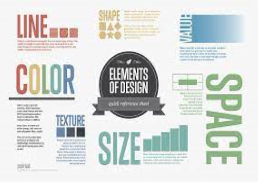
Graphic design is a multifaceted field that involves the use of various elements to create visually appealing and effective designs. The key elements of graphic design include: Line: Lines are fundamental to graphic design. They can be straight or curved, thick or thin, and can be used to create structure, define boundaries, and guide the viewer's eye. Lines also convey mood and emotion; for example, curved lines may suggest fluidity and movement, while straight lines can convey stability and order. Shape: Shapes are two-dimensional forms created by connecting lines or by enclosing an area. They can be geometric (e.g., squares, circles, triangles) or organic (irregular and freeform). Shapes are used to create visual interest, define objects, and contribute to the overall composition of a design. Color: Color is a powerful element in graphic design. It can evoke emotions, convey meaning, and create visual impact. Designers use color theory to select appropriate color palettes that resonate with the message and audience of a design. Color can be used for emphasis, contrast, and to establish a brand identity. Texture: Texture refers to the visual or tactile quality of surfaces. It can be real (photographs of textures) or simulated (created through patterns or shading). Texture adds depth and tactile qualities to a design, enhancing its visual appeal and creating a sense of realism or dimension. Typography: Typography involves the selection and arrangement of typefaces (fonts) to convey a message effectively. Different fonts have distinct personalities and are chosen based on the tone and purpose of the design. Typography includes considerations like font size, spacing (kerning and leading), and alignment. Space: Space in graphic design is the area around and within design elements. Proper spacing, also known as negative space or white space, is essential for readability and visual balance. It helps to separate and organize content and elements within a composition. Hierarchy: Hierarchy establishes a visual order within a design, indicating the relative importance of different elements. Designers use techniques like size, color, contrast, and placement to guide the viewer's attention and convey the most important information first. Balance: Balance refers to the distribution of visual weight within a design. Designs can be balanced symmetrically (evenly balanced on both sides) or asymmetrically (with different elements creating balance in an asymmetrical arrangement). Balance ensures that a design feels stable and harmonious. Contrast: Contrast involves the juxtaposition of different elements to create visual interest and make certain elements stand out. Contrast can be achieved through differences in color, size, shape, texture, or typography. It helps direct attention and highlight key information. Unity: Unity or cohesion ensures that all elements within a design work together cohesively to convey a unified message or concept. It helps create a sense of completeness and visual harmony. These key elements of graphic design are essential tools that graphic designers use to convey information, communicate ideas, and create visually compelling and effective designs across various media and platforms. The successful combination and manipulation of these elements result in engaging and impactful visual communication.


