Get the latest updates From BL Soni College Bhilwara

How can graphic design be used to create visually appealing restaurant menus?
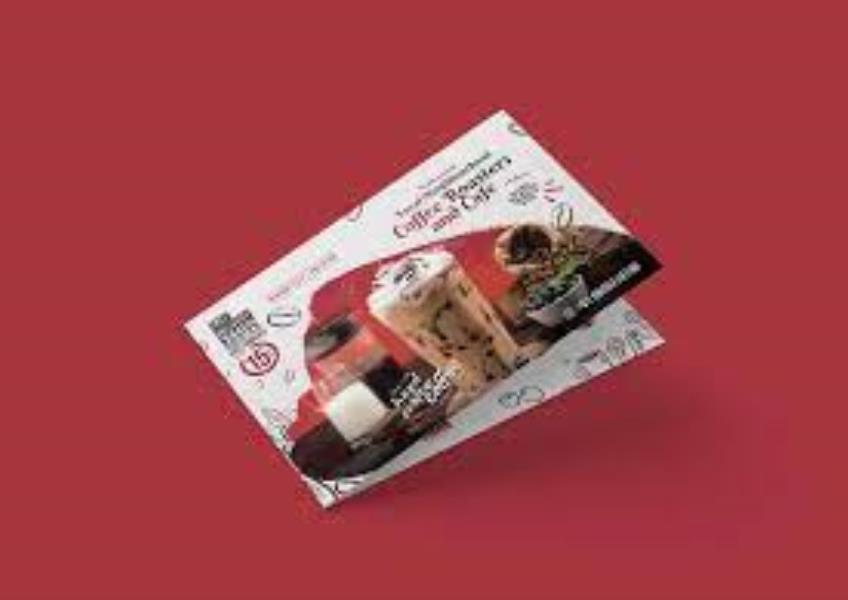
Graphic design is a powerful tool for creating visually appealing restaurant menus that not only showcase the offerings but also entice diners and reflect the restaurant's brand identity. Here are some key ways to use graphic design effectively for restaurant menus: Understand the Brand: Begin by understanding the restaurant's brand identity, including its theme, ambiance, and target audience. The menu should align with and reinforce the restaurant's overall image. Hierarchy and Organization: Organize the menu items in a clear and logical hierarchy. Use headings, subheadings, and typography to guide customers' eyes to the most important sections and dishes. Typography: Choose fonts that are legible and match the restaurant's style. Differentiate headings, dish names, descriptions, and prices using variations in font size, style, or color. Ensure that the text is easy to read in various lighting conditions. Color Palette: Select a color palette that complements the restaurant's decor and theme. Use color strategically to draw attention to key elements, such as headings, specials, or featured dishes. Imagery: Incorporate high-quality images of menu items, particularly for visually-driven cuisines like sushi or desserts. Images can help customers visualize their meal choices and create anticipation. Ensure that the images are consistent in style and quality. Layout and White Space: Use a well-organized layout with ample white space to avoid visual clutter. A clean and uncluttered design enhances readability and aesthetics. Icons and Symbols: Use icons or symbols to represent dietary information (e.g., vegetarian, gluten-free) or to highlight special features (e.g., spicy, chef's recommendation). Grid Design: Consider using a grid layout for your menu to maintain consistency in the arrangement of items and ensure a balanced and aesthetically pleasing design. Categorization: Group similar items into categories (e.g., appetizers, entrees, desserts). Employ dividers, lines, or shading to visually separate sections. Highlight Specials: Make daily specials or featured items stand out with unique design elements such as borders, background colors, or illustrations. Descriptive Language: Craft compelling and descriptive dish names and descriptions. Use enticing words that evoke flavors, textures, and aromas to make the dishes more appealing. Pricing Presentation: Present prices clearly and consistently. Use a uniform font size and placement to make it easy for customers to identify prices. Seasonal Changes: Update the menu design seasonally to reflect changes in the menu offerings and ingredients. This keeps the menu fresh and exciting. Quality Printing: Invest in high-quality printing to ensure that the colors and images on the menu appear as intended. Matte or gloss finishes can also affect the overall appearance. Menu Covers: Consider the design of menu covers or holders. They are the first things customers see, so they should be inviting and align with the restaurant's theme. Sustainability: If the restaurant values sustainability, consider using eco-friendly materials for menu printing or showcasing eco-friendly certifications. User Testing: Before finalizing the design, conduct user testing or gather feedback from staff and customers to ensure that the menu is user-friendly and aesthetically pleasing. Digital Menus: For online or digital menus, ensure that the design is responsive and user-friendly across various devices and screen sizes. A well-designed menu not only looks visually appealing but also enhances the dining experience, making it easier for customers to make choices and enjoy their meal. It can also be a powerful marketing tool that encourages customers to return to your restaurant.


