Get the latest updates From BL Soni College Bhilwara

graphic design be used to create visually appealing presentations
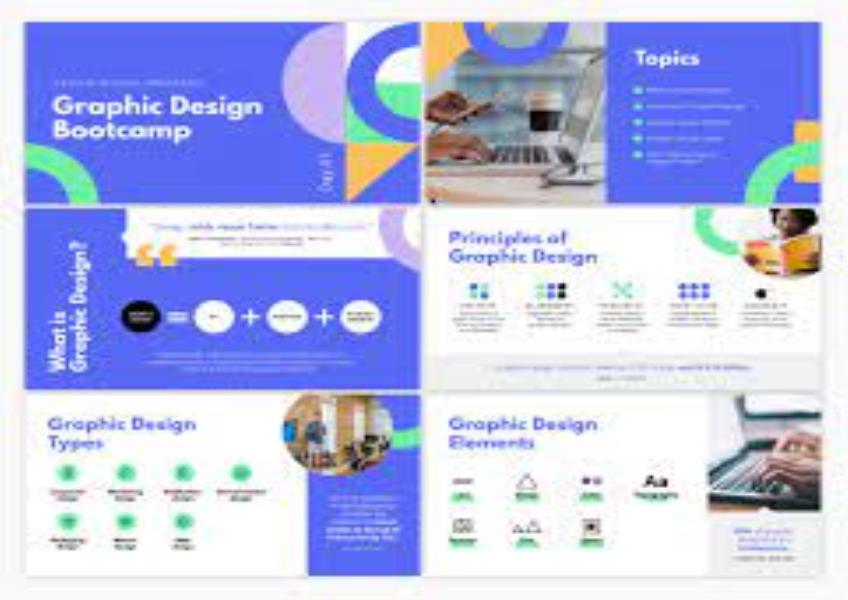
Graphic design plays a crucial role in creating visually appealing presentations. A well-designed presentation not only conveys information effectively but also engages and captivates the audience. Here are some key principles and tips on how to use graphic design to create visually appealing presentations: Consistency: Maintain a consistent visual style throughout your presentation. Use the same color scheme, fonts, and design elements to create a cohesive and professional look. Hierarchy: Establish a clear hierarchy of information by varying text size, color, and font weight. Important points should stand out while less important details should be less prominent. Typography: Choose fonts that are easy to read and complement your content. Stick to a maximum of two or three font families to maintain consistency. Use font size and formatting (bold, italics, underline) to emphasize key points. Color: Use a limited color palette that complements your brand or theme. Avoid using too many colors, as it can be distracting. Ensure there is enough contrast between text and background colors for readability. Whitespace: Embrace whitespace or negative space to give your content room to breathe. It makes your presentation look clean and helps focus attention on key elements. Images and Graphics: Use high-quality images and graphics that are relevant to your content. Avoid pixelated or low-resolution visuals. Incorporate visuals that enhance understanding and engagement. Icons and Symbols: Icons and symbols can simplify complex information and make your slides more visually appealing. Use them sparingly to represent concepts or ideas. Alignment: Maintain a consistent alignment for text and objects. Align elements to a grid or guideline to ensure a clean and organized layout. Contrast: Create contrast between elements to make them stand out. This can be achieved through color, size, shape, or placement. Contrast helps guide the viewer's eye to important content. Transitions and Animations: Use transitions and animations sparingly and purposefully. They can add visual interest but should not distract from the content. Visual Data Representation: When presenting data, use charts and graphs that are easy to understand. Choose the right type of chart for your data, label axes clearly, and use color strategically to highlight key points. Branding: If the presentation is associated with a brand or organization, incorporate the brand's logo and colors into the design to reinforce brand identity. Simplicity: Keep slides uncluttered and avoid overcrowding with text or visuals. Each slide should convey a single, clear message. Testing: Test your presentation on different screens and projectors to ensure that colors, fonts, and visuals appear as intended. Accessibility: Consider accessibility by using high contrast for text, providing alternative text for images, and ensuring that your presentation is usable for individuals with disabilities. Feedback: Seek feedback from colleagues or peers to get a fresh perspective on your design and content. Practice: Practice delivering your presentation to ensure a smooth and engaging delivery. Make sure your visuals complement your spoken words. Remember that the goal of graphic design in presentations is not just to make them look good but also to enhance communication and understanding. Well-designed presentations can leave a lasting impression and effectively convey your message to your audience.


