Get the latest updates From BL Soni College Bhilwara
. What are some key principles of good visual hierarchy in graphic design?
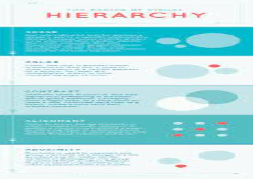
Creating a strong visual hierarchy is essential in graphic design to guide the viewer's eye, communicate information effectively, and emphasize the most important elements. Here are some key principles of good visual hierarchy: Prioritization: Determine the most important message or information you want to convey in your design. Make it clear to the viewer what the primary focus is. Contrast: Use contrast in elements such as color, size, typography, and spacing to highlight the most important content. Elements that contrast with the rest of the design will naturally draw the viewer's attention. Typography: Choose fonts and typefaces that distinguish between different levels of information. Use larger, bolder, or different fonts for headlines and titles to make them stand out. Size and Scale: Larger elements tend to attract more attention. Use size variations to indicate the hierarchy of information. Important elements should be larger, while less important ones should be smaller. Color: Color can be a powerful tool for creating hierarchy. Use color to highlight key elements or to group related information. Be consistent with your color choices and avoid overwhelming the viewer with too many colors. Whitespace: Properly use whitespace (negative space) to separate and frame different sections of your design. It can help create a sense of order and guide the viewer's eye. Alignment: Align elements consistently to create a sense of order and structure. Use a grid system to maintain alignment throughout your design. Grouping and Proximity: Group related elements together and place them close to each other. This helps viewers understand the relationships between elements and quickly identify patterns. Visual Cues: Use visual cues like arrows, lines, icons, or shapes to direct the viewer's attention to specific areas or actions within the design. Focal Point: Establish a focal point in your design—a central element that stands out and captures the viewer's attention. This focal point should align with your design's primary message or purpose. Hierarchy in Typography: Within text content, establish a typographic hierarchy using font styles (e.g., bold, italic), font sizes, color, and spacing to differentiate between headings, subheadings, and body text. Consistency: Maintain consistency in your design elements, such as fonts, colors, and spacing, to create a cohesive and visually pleasing hierarchy. Testing and Iteration: Test your design with real users or colleagues to see if the visual hierarchy effectively guides their attention and comprehension. Be open to making revisions based on feedback. Responsive Design: Consider how your visual hierarchy will adapt to different screen sizes and devices in web and mobile design. Ensure that the hierarchy remains effective across various contexts. Simplicity: Avoid clutter and unnecessary complexity. A clean and simple design is often more effective at conveying information and maintaining hierarchy. Effective visual hierarchy ensures that viewers can quickly and intuitively understand the content and purpose of a design. By applying these principles, you can create designs that communicate clearly, engage the audience, and convey your intended message with impact.