Get the latest updates From BL Soni College Bhilwara
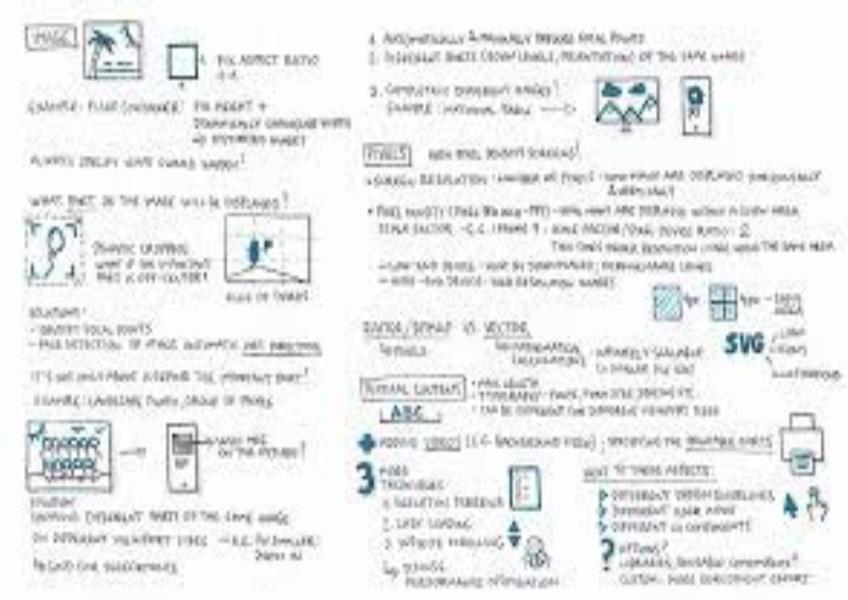
What are some key considerations when designing for different screen sizes?
Designing for different screen sizes is crucial in today's digital landscape, where users access websites, applications, and content on a wide range of devices, from desktop computers to smartphones and tablets. Here are some key considerations when designing for different screen sizes: Responsive Design: Use responsive design principles to create layouts that adapt to various screen sizes and orientations seamlessly. This approach ensures that your content remains accessible and user-friendly on all devices. Prioritize Mobile-First Design: Start by designing for mobile devices first and then scale up to larger screens. This approach ensures that your design is optimized for smaller screens, which often have more limited space and different interaction patterns. Fluid Layouts: Create fluid and flexible layouts that adjust proportionally to the screen size. Use percentage-based widths and heights instead of fixed pixel values for elements like containers, images, and columns. Breakpoints: Identify key breakpoints where your design needs to adapt to different screen sizes. Common breakpoints include those for mobile, tablet, and desktop views. Adjust layout, typography, and navigation as needed at each breakpoint. Content Prioritization: Determine the most critical content and features for each screen size. Display the essential information prominently while potentially hiding less critical elements in collapsible menus or behind "read more" links on smaller screens. Typography: Choose fonts and font sizes that are legible on both small and large screens. Ensure that text remains readable without the need for zooming or excessive scrolling. Touch-Friendly Elements: Design touch-friendly elements for mobile devices by providing adequate spacing between interactive elements like buttons and links. Make sure buttons and touch targets are large enough for users to tap comfortably. Images and Media: Optimize images and media for different screen resolutions and sizes. Use responsive image techniques to serve appropriately sized images based on the user's device to reduce load times and data usage. Navigation and Menus: Simplify navigation for smaller screens. Consider using collapsible or off-canvas menus, hamburger menus, or tabbed navigation to save space. Ensure that navigation remains accessible and easy to use. Forms and Input Fields: Adjust form fields and input elements to be touch-friendly on mobile devices. Use adaptive input types (e.g., number, email) for mobile keyboards. Consider using autocomplete and input masks to streamline data entry. Media Queries: Use CSS media queries to apply different styles and layouts based on screen characteristics such as width, height, orientation, and resolution. These queries allow you to fine-tune your design for various devices. Performance Optimization: Optimize your design for performance by minimizing the use of large images, unnecessary scripts, and complex animations, especially on mobile devices with limited processing power and slower connections. Testing Across Devices: Test your design on a variety of real devices, including smartphones, tablets, and desktop computers, as well as different web browsers. This testing helps identify and address issues specific to each device and browser. User Testing: Conduct usability testing with real users on different devices to gather feedback and identify any usability issues or design flaws. User feedback is invaluable for refining your responsive design. Accessibility: Ensure that your responsive design is accessible to users with disabilities on all devices. Follow web accessibility guidelines to provide an inclusive experience. Progressive Enhancement: Implement a progressive enhancement strategy, starting with a basic, functional design and then adding advanced features and styling for larger screens and more capable devices. Designing for different screen sizes requires careful planning, testing, and attention to detail to create a consistent and user-friendly experience across a wide range of devices. By considering these considerations, you can ensure that your design is adaptable and accessible to users on various screens.