Get the latest updates From BL Soni College Bhilwara
How can graphic design be used to create visually appealing magazine layouts
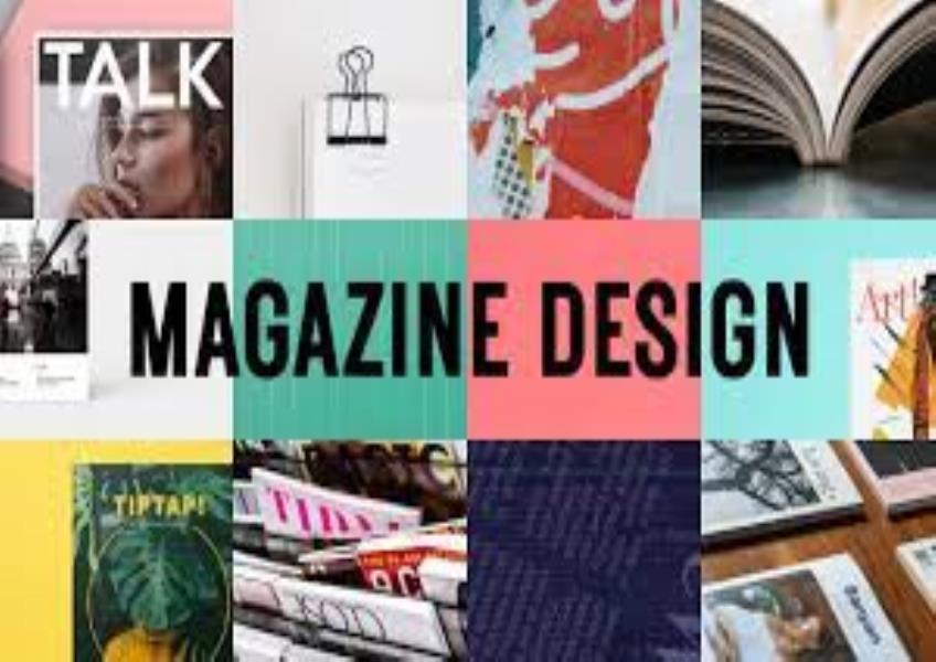
Creating visually appealing magazine layouts is a combination of art and design principles that enhance readability, engagement, and overall aesthetics. Here are some tips and techniques for using graphic design to create captivating magazine layouts: Understand the Audience and Content: Begin by understanding your target audience and the content of the magazine. Different demographics and topics may call for different design approaches. Establish a Grid System: Design a consistent grid system that serves as the backbone of your layout. A grid helps maintain order, alignment, and readability across pages. Hierarchy of Information: Establish a clear hierarchy to guide readers through the content. Use typographic hierarchy (headlines, subheadings, body text) and visual cues (color, size, position) to emphasize key elements. Consistency in Typography: Choose a readable and harmonious combination of fonts for headings and body text. Consistency in typography contributes to a polished and professional look. Color Palette: Develop a cohesive color palette that complements the magazine's theme and evokes the desired mood. Use color consistently for headings, subheadings, and other design elements. Whitespace and Margins: Allow for ample white space around text and images. Margins and padding create breathing room and enhance readability. Balance and Symmetry: Create visual balance within your layout, whether it's symmetrical or asymmetrical. Balance helps distribute visual weight evenly across the page. Image Placement: Use high-quality images that complement the content. Crop, resize, and arrange images thoughtfully to integrate them seamlessly into the design. Captions and Image Credits: Include clear and concise image captions and credits. Properly attributing images is essential for ethical and legal reasons. Pull Quotes and Callouts: Use pull quotes and callout boxes to highlight key quotes or interesting snippets of text. These break up the layout and draw attention to important content. Drop Caps and Initials: Employ drop caps or initial letters at the beginning of articles or sections to add a decorative and stylistic touch. Text Wrap and Typography Effects: Experiment with text wrap around images and typography effects to create visual interest and break up the monotony of columns. Consistent Column Widths: Maintain consistent column widths across the layout for a neat and orderly appearance. Interactive and Multimedia Elements: In digital magazines, consider adding interactive elements like hyperlinks, videos, and slideshows to engage readers. Navigation and Page Numbers: Ensure that readers can easily navigate the magazine. Include page numbers, a table of contents, and section headings for clear organization. Infographics and Data Visualizations: Incorporate infographics and data visualizations to present complex information in an engaging and understandable way. Text Flow and Readability: Pay attention to text flow and readability. Avoid excessive hyphenation, widows, and orphans. Ensure that text columns have an appropriate line length. Consistent Branding: If the magazine is part of a brand or publication series, maintain consistent branding elements, such as logos and color schemes. Testing and Proofreading: Thoroughly proofread and test the layout to catch typos, layout errors, or design inconsistencies before publication. Feedback and Iteration: Seek feedback from colleagues or test readers and be open to making improvements based on their input. Ultimately, the goal of a magazine layout is to enhance the reader's experience and engagement with the content. Effective graphic design plays a pivotal role in achieving this goal by combining aesthetics, readability, and organization.