Get the latest updates From BL Soni College Bhilwara
What are some key principles of good color usage in graphic design?
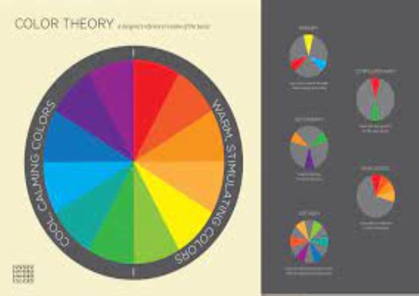
Effective use of color is a fundamental aspect of graphic design, influencing how viewers perceive and engage with visual content. Here are some key principles of good color usage in graphic design: Color Theory Understanding: Familiarize yourself with color theory, which explores the relationships between colors and their psychological effects on viewers. Understand concepts like color harmony, contrast, and the color wheel. Purpose and Message: Consider the purpose and message of your design when selecting colors. Different colors evoke different emotions and convey various meanings. Ensure that your color choices align with the intended message and audience. Color Wheel and Harmony: Use the color wheel to create harmonious color schemes. Common color harmonies include complementary (opposite colors on the wheel), analogous (adjacent colors), and triadic (equally spaced colors). Contrast: Incorporate contrast to make important elements stand out. Contrast can be achieved through differences in color, value (lightness or darkness), saturation (intensity), or temperature (warm vs. cool). Legibility and Readability: Ensure that text is legible by choosing appropriate text and background colors. High contrast between text and background improves readability. Hierarchy and Emphasis: Use color to establish a hierarchy of information. Important elements such as headlines, calls to action, or key points can be emphasized with contrasting or vibrant colors. Consistency: Maintain consistency in color usage across a project or brand. Establish a color palette and stick to it to create a cohesive and recognizable visual identity. Color Psychology: Be mindful of color psychology. Different colors can evoke specific emotions and associations. For example, red can convey excitement or passion, while blue often represents trust or calmness. Color Accessibility: Consider color accessibility by ensuring that your design is usable by individuals with color vision deficiencies. Test your color choices with tools like color contrast checkers to meet accessibility standards. Cultural Awareness: Be aware of cultural and regional color associations. Colors can have different meanings in various cultures, so research is essential when designing for diverse audiences. Minimalism and Simplicity: In some cases, a minimalist approach with a limited color palette can create a clean and sophisticated look. Simplicity can be powerful. Trends vs. Timelessness: Be cautious when following design trends. What's trendy today may quickly become outdated. Consider whether a timeless or trend-driven approach is more suitable for your project. A/B Testing: In digital design, consider conducting A/B testing to compare different color variations of a design to determine which one performs better with your target audience. Visual Hierarchy: Use color to establish a visual hierarchy within your design. For instance, use bold, vibrant colors for primary information and lighter, subtler colors for secondary or background elements. Context and Purpose: Evaluate how color choices will be perceived in the specific context of your design. Different industries and purposes may require unique color palettes. Color Relationships: Understand color relationships, such as warm and cool colors, and how they can influence the mood and atmosphere of a design. Testing and Feedback: Test your color choices with sample audiences and gather feedback. Sometimes, viewer preferences can provide valuable insights. Balance: Achieve visual balance by distributing colors evenly throughout your design, avoiding overly dominant or distracting colors. Effective color usage in graphic design goes beyond aesthetics; it can enhance communication, evoke emotions, and convey meaning. By applying these principles, designers can create visually appealing and impactful designs that resonate with their target audience.