Get the latest updates From BL Soni College Bhilwara
What are some key principles of good composition in graphic design?
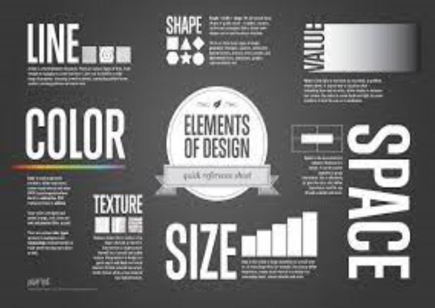
Good composition is essential in graphic design as it helps convey a message effectively, create visual appeal, and guide the viewer's eye. Here are some key principles of good composition in graphic design: Balance: Achieving visual equilibrium is crucial. Balance can be symmetrical (equal visual weight on both sides) or asymmetrical (different elements are balanced through contrast). Hierarchy: Establish a clear visual hierarchy to guide the viewer's eye. Use size, color, contrast, and placement to emphasize important information and create a flow of information. Alignment: Align elements with each other to create order and structure. Consistent alignment helps unify a design and make it easier to read. Contrast: Contrast makes elements stand out and adds visual interest. Utilize contrast in color, size, shape, and typography to draw attention to key elements. Repetition: Repeating certain design elements (like colors, fonts, shapes, or patterns) throughout the design creates unity and reinforces the message. Proximity: Group related elements together to show their association. This helps reduce clutter and aids in the organization of information. Whitespace: Also known as negative space, whitespace provides breathing room for the design and allows the viewer's eye to rest. It can also emphasize key elements. Simplicity: Keep designs clean and uncluttered. Avoid unnecessary elements that don't contribute to the message. Alignment to a Grid: Grid-based layouts help maintain consistency and alignment, making it easier to organize and structure your design. Typography: Pay attention to font choice, size, spacing, and hierarchy. Typography is a critical aspect of composition in graphic design. Color Harmony: Choose a harmonious color palette that supports the message and evokes the desired emotions. Visual Flow: Create a natural flow for the viewer's eye to follow. This typically involves arranging elements to lead the eye from the most important to secondary information. Focal Point: Every design should have a focal point that draws the viewer's attention. This can be achieved through contrast, size, or placement. Consistency: Maintain a consistent style throughout the design, including the use of color, typography, and imagery. Rhythm and Repetition: Create a sense of rhythm by repeating visual elements at regular intervals, which can enhance the overall design's cohesiveness. Rule of Thirds: Divide the composition into thirds both vertically and horizontally. Placing key elements along these lines or at their intersections often creates a balanced and visually appealing layout. Visual Simplicity: The design should be easily digestible at a glance. Avoid overwhelming the viewer with too much information or complexity. Audience Consideration: Always keep the target audience in mind. Tailor the composition to their preferences and expectations. Testing and Iteration: Don't be afraid to test different compositions and iterate on your design. Solicit feedback to make improvements. Remember that these principles can be combined and adapted to suit the specific needs of your project. Effective graphic design often involves a delicate balance between these principles, and the success of a design depends on how well they are applied in context.