Get the latest updates From BL Soni College Bhilwara
What are some key principles of visual hierarchy in graphic design?
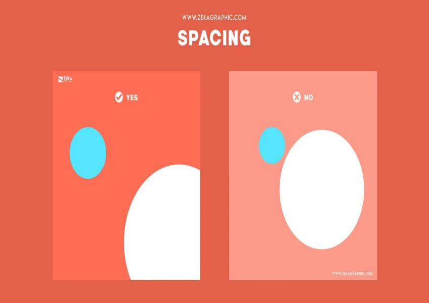
Visual hierarchy is a fundamental principle in graphic design that helps guide viewers' attention and comprehension of a design or layout. By organizing elements effectively, designers can convey information more clearly and make the content more engaging. Here are some key principles of visual hierarchy: Hierarchy of Importance: Establish a clear hierarchy of information based on the relative importance of elements. This helps users quickly identify the most important content and navigate through the design. Contrast: Use contrast in elements like size, color, typeface, and spacing to highlight important content. Larger text, bolder colors, and increased contrast draw the eye and signal importance. Typography: Font Size: Larger font sizes typically denote headlines or important text, while smaller sizes are used for body text or less critical information. Font Weight: Bold or heavy fonts can be used to emphasize key phrases or headings. Typefaces: Limit the number of typefaces used to maintain consistency and clarity. Different typefaces can be used to distinguish between headings, subheadings, and body text. Color: Color Contrast: Vibrant or contrasting colors can make important elements stand out. Use color strategically to draw attention. Color Consistency: Maintain a consistent color scheme throughout the design to create a cohesive visual identity. Whitespace: Proper spacing between elements provides visual breathing room and helps users differentiate between content sections. It also reduces visual clutter. Alignment: Elements aligned along a common axis create a sense of order and organization. Centered alignment can be used for emphasis, while left-aligned text is often easier to read. Proximity: Group related elements closely together and separate unrelated ones. Users tend to perceive items that are physically close to each other as related. Size and Scale: Larger elements naturally draw more attention. Use size variations to indicate importance or create visual interest. Visual Cues: Icons, arrows, lines, and other graphical cues can direct the viewer's gaze and highlight specific elements or actions. Consistency: Maintain a consistent layout and design style throughout the project. Consistency helps users understand how the content is organized and what to expect. Focal Points: Designate one or more focal points in your layout where you want users to focus their attention. Use techniques like color, size, or contrast to create these focal points. Flow and Direction: Use visual elements to guide the viewer's eye through the design in a logical and engaging way. Consider the natural reading order (left to right in many cultures) and design accordingly. Layering and Depth: The use of layers and depth cues like shadows and overlapping elements can add depth to a design and create a sense of hierarchy. Progressive Disclosure: For complex information, use progressive disclosure to reveal details gradually as the user interacts with the design, reducing cognitive overload. Testing and Iteration: Conduct usability testing to ensure that the visual hierarchy effectively guides users. Iterate on your design based on user feedback and observations. By applying these principles of visual hierarchy, graphic designers can create designs that are not only visually appealing but also easy for users to understand and navigate, resulting in a more effective communication of information and a better user experience.