Get the latest updates From BL Soni College Bhilwara
What are some common color schemes used in graphic design?
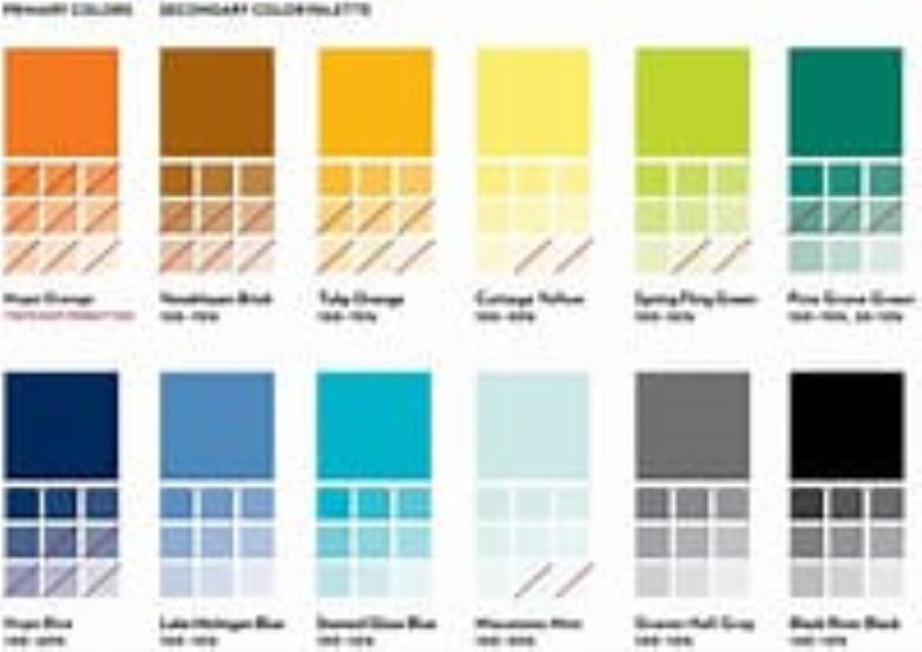
In graphic design, color schemes or color harmonies are combinations of colors that work well together and create a visually appealing and harmonious composition. Various color schemes are used to achieve different visual effects and convey specific emotions or messages. Here are some common color schemes used in graphic design: Monochromatic: Definition: Monochromatic color schemes use variations of a single color by altering its shade, tint, or tone. Effect: This scheme is elegant and simple, with a calming and unified look. It's easy on the eyes and often used for minimalist designs. Complementary: Definition: Complementary color schemes consist of colors that are directly opposite each other on the color wheel (e.g., red and green, blue and orange). Effect: Complementary colors create strong contrast and vibrancy. They are often used to make specific elements stand out and evoke excitement or tension. Analogous: Definition: Analogous color schemes use colors that are adjacent to each other on the color wheel (e.g., blue, green, and teal). Effect: Analogous colors create a sense of harmony and are visually pleasing. They are often used for designs that require a unified and soothing appearance. Triadic: Definition: Triadic color schemes consist of three colors evenly spaced around the color wheel, forming an equilateral triangle (e.g., red, blue, and yellow). Effect: Triadic schemes are vibrant and provide a balanced contrast. They work well for designs that need to be visually engaging while maintaining harmony. Split-Complementary: Definition: Split-complementary color schemes involve a base color and two colors adjacent to its complementary color (e.g., red, yellow-green, and blue-green). Effect: This scheme offers a strong contrast with less tension than a pure complementary scheme. It provides balance while allowing for visual interest. Tetradic (Double Complementary): Definition: Tetradic color schemes consist of two pairs of complementary colors (e.g., red and green, blue and orange). Effect: Tetradic schemes are visually rich and diverse. They can be challenging to balance but offer opportunities for dynamic and exciting designs. Warm and Cool Colors: Definition: Warm colors (e.g., red, orange, yellow) and cool colors (e.g., blue, green, purple) are used to create contrast and convey temperature or emotion. Effect: Warm colors evoke energy, excitement, and warmth, while cool colors convey calmness, tranquility, and professionalism. Mixing warm and cool colors can create balance and visual interest. Neutral Color Schemes: Definition: Neutral color schemes typically use shades of gray, white, beige, or black as the dominant colors, with the addition of one or two accent colors. Effect: Neutral schemes provide a clean and timeless look. They are often used for minimalistic and sophisticated designs, with accent colors adding subtle pops of interest. Designers choose color schemes based on the specific goals, target audience, and emotions they want to convey in their projects. Experimenting with different color combinations can lead to unique and effective design solutions.