Get the latest updates From BL Soni College Bhilwara
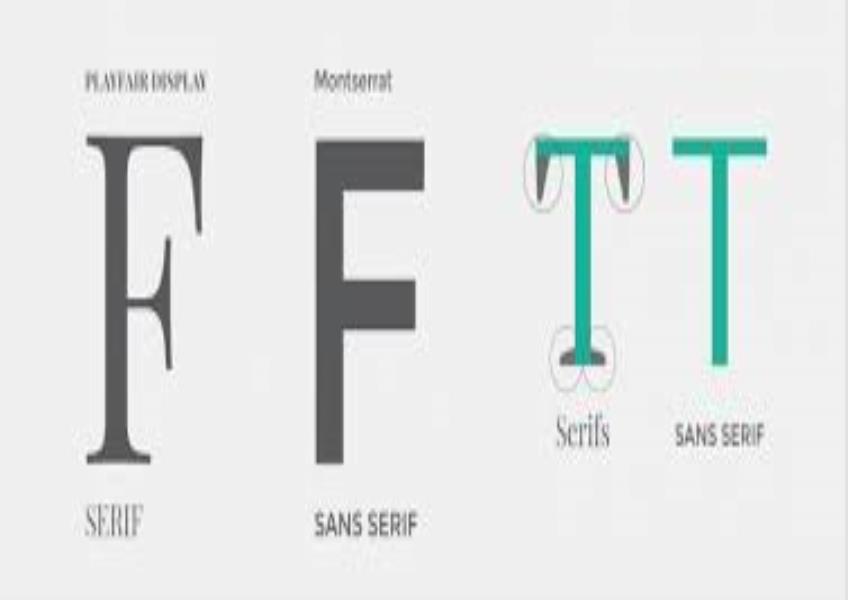
What is the difference between serif and sans-serif fonts?
Serif and sans-serif are two main categories of typefaces or fonts in typography, and they differ primarily in the presence or absence of small lines or "serifs" at the ends of the characters (letters and symbols). Here are the key differences between serif and sans-serif fonts: Serif Fonts: Serifs: Serif fonts have small decorative lines or strokes (serifs) at the ends of characters. These serifs can be short and flat (known as "slab serifs") or more stylized and curved. Legibility: In print, serif fonts are often considered more legible and easier to read, especially in longer bodies of text, such as books and newspapers. The serifs are believed to guide the reader's eye along the lines of text. Traditional and Formal: Serif fonts are often associated with a more traditional, formal, and classic appearance. They are commonly used for formal documents, books, and printed materials. Examples of serif fonts: Times New Roman, Georgia, Baskerville, and Garamond. Sans-serif Fonts: Sans-serif: The term "sans" means "without," so sans-serif fonts are characterized by the absence of serifs. They have clean, simple lines without decorative flourishes at the ends of characters. Modern and Informal: Sans-serif fonts are often considered more modern, clean, and informal compared to serif fonts. They are frequently used in digital media, web design, and contemporary graphic design. Legibility: Sans-serif fonts are often preferred for on-screen reading and display text, as they tend to be more legible at smaller sizes and on low-resolution screens. Examples of sans-serif fonts: Arial, Helvetica, Calibri, and Verdana. Choosing between serif and sans-serif fonts depends on the context and purpose of the design: Serif fonts are commonly used for body text in printed materials like books, magazines, and newspapers. They are also appropriate for formal documents and invitations. Sans-serif fonts are popular for digital content, website text, presentations, and headings. They are often used when a clean and contemporary look is desired. It's important to note that there are many subcategories and variations within serif and sans-serif fonts, each with its own unique style and characteristics. Designers choose fonts based on the specific needs of a project and the desired visual and communicative impact.